
Weddings
Wedding design
I've been lucky enough to help quite a few couples with their weddings and it's always been a delight. Not a bridezilla or groomzilla in sight, just lovely, unique and beautiful people and their equally beautiful celebrations.
Below are some of the stories.
Double happiness
I think we all remember the first big event we went to after Covid restrictions lifted. Everyone was a bit nervous, a bit excited, and filled with joy to be experiencing the power of a crowd again. The wedding of Waverley and Dave was exactly that. The party to end all parties.
Waverley hails from New Zealand, while Dartford-boy Dave has Chinese heritage. Their wedding at Trinity Buoy Wharf in London was always going to combine both cultures. We went for a monochrome typography and fern concept, with a red double happiness symbol puncutating the design. All handwritten text is in Waverley’s own hand.
The wedding invites were printed on Nettuno 280gsm paper with a vellum overlay sheet.


USA meets Luxembourg wedding
Marc is from Luxembourg, Whitney is from the US. They were married on Independence Day, so wanted a red, white and blue theme, but also wanted to reference the two countries uniting. I stumbled across a gorgeous old stamp from the 1960's and adapted the lion to be marching along with a simplified American flag. The lion was matched with a simple sans serif typeface and lots of white space. Together, the invitations look modern and unfussy, the feel that Marc and Whitney were hoping for.
The save the dates were printed by Moo.com on Luxe postcards with a red seam. The formal invitations were letterpressed by Blush on 700gsm Colorplan Pristine White with red painted edges, double-sided in two languages.


Wise Winery
For a wedding in a winery, we went with the rich ruby of red wine and the earthy green of the leaves, intertwining to create their initials. The little owl heart was inspired by a print I'd seen on Etsy and brought in as a reference to the name of the vineyard (Wise Winery). Printed onto 300gsm Tintoretto Gesso.


Botanical greenhouse wedding
Ange and Rich were getting married at the stunning Clifton Nurseries in London, so we decided to keep things botanical. We found an absolute treasure trove of source material on the Biodiversity Heritage Library Flickr page. I designed the invitations and the on-the-day elements like the table plan, place names and table numbers.


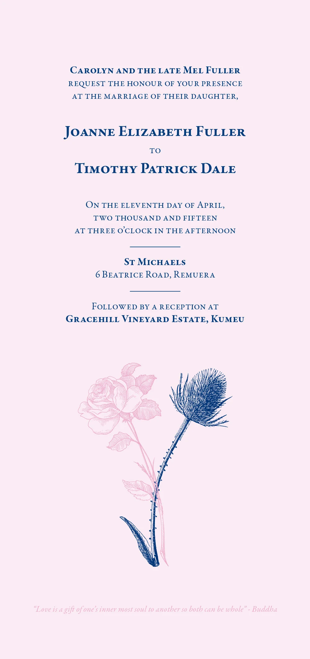
The Scottish thistle and the English rose
Jo and Tim were married in New Zealand in April 2015. While both proper kiwi kids (albeit living in London these last 7 years) they both have British heritage. Family is really important to them, so we included an English rose and a Scottish thistle intertwining to show their history combining into one future. They wanted something classic and elegant, using blush and navy as the main colours. To achieve this, I sourced some engraving-style illustrations of the plants, and paired them with Garamond, for a traditional and simple feel. They were printed onto Sirio Pearl Polar card.


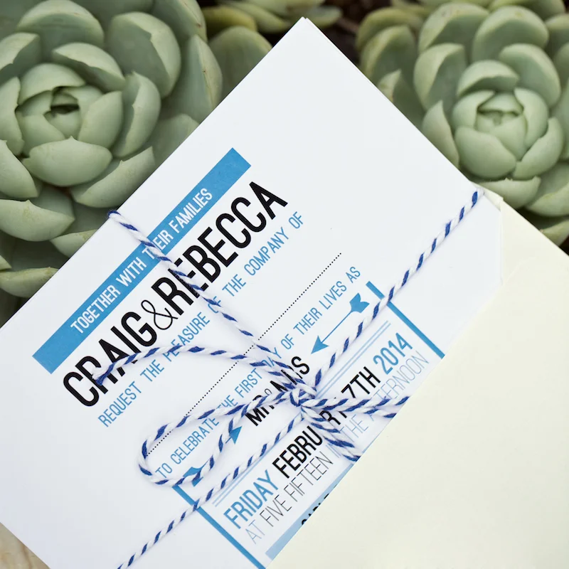
Waiheke wedding
When Bex and Craig were planning their wedding, they wanted their wedding stationary to feel like 'them' - relaxed, friendly, with maybe a nod to their mutual love of rugby. It was to take place at outside on the lawn at Cable Bay vineyard on Waiheke Island, New Zealand, so the stationary features lots of soft blue colours, to reflect the sun and sky of the setting. A full range of stationary was created, including invitations, RSVP postcards, information cards, thank you cards, a table plan, table names, as well as a message tree for the guests to sign at the wedding reception. Wedding photos by the talented Shine Studios


Woolshed wedding
Nikki and Shane's wedding took place in a woolshed in the middle of the bush, half way between Whakatane and Ohope in New Zealand. The wedding was rustic and tactile, so the stationary reflected that - native ferns with muted colours, and the invitations were printed on thick uncoated stock with a lovely textured feel. I created email save-the-dates, the invitation, information card, chutney labels and place names.


