light and dark
I saw an image on Pinterest a few weeks back, and liked the shadows as type effect so today I had a bash at making a few of my own. It was a bit of a brain exercise to get the text orientation right, more than I can really be dealing with while slightly hungover. Cutting in a straight line was difficult enough.
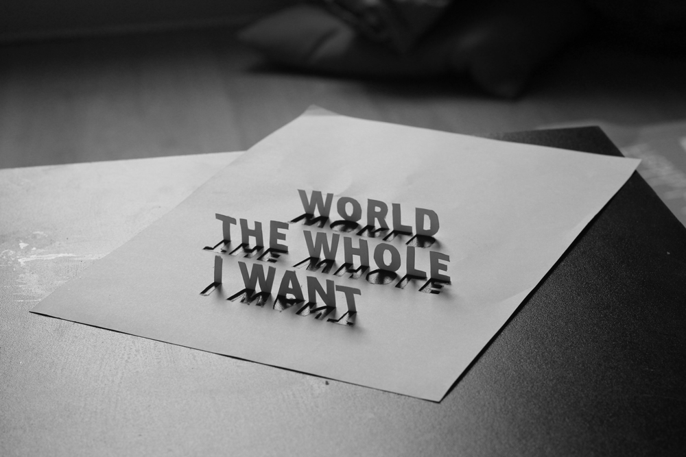
This was the first attempt and I got the text orientation wrong. Flipped around though, the contrast and strength of letters is nice. Quote is Charles Bukowski, but I ran out of steam before finishing the whole thing (I want the whole world or nothing)

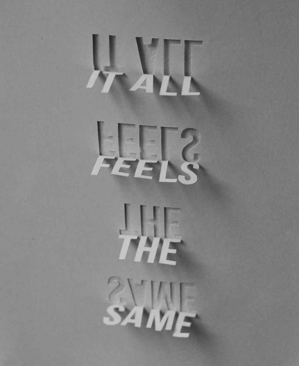
The multiple shadow effect comes from the lamp in the lounge which has five bulbs in a row. The words are the title of a Tennis song
Stuck it to the wall to try a different angle. It loses the shadow text, but it still has a nice effect.