Towards the end of last year I had a call from Sally from Harvard Business Publishing about doing a bit of work for an upcoming book launch. They needed an invitation, a mini brochure and a slide template for the event, to be held at the beautiful V&A in London. The design needed to tie in somewhat to the book cover design but also reflect the HBP brand.
Read MoreLast week I created an infographic for Unquoted, who are launching a crowdfunding campaign to raise money to build an Investor Relations platform. The infographic is split into four sections that they can share over their social platforms to help spread the word to potential investors.
Read MoreFor the last eight months, I've been working with Euromoney Institutional Investor Thought Leadership to build the brand of their new business. I've created their identity, brand materials, brochures, and website but we had just one final part of the puzzle remaining. Their showcase piece. A report and survey that shows their capability as a business. The report researched the impact of content marketing and thought leadership as a B2B marketing strategy tool, taking results from a global survey of senior business executives.
Read MoreI've been able to design a lot of cool stuff over the years, but this was probably the thing I was most excited to receive a sample of. My client, The Economist Educational Foundation, runs a news club called The Burnet News Club, and membership includes a little pin-badge that students proudly wear on their school jackets. Manufactured by Stupid Tuesday, I'm besotted with them, and one is proudly adorning my leather jacket.
Read MoreLet 2015 be known as the year of the wedding. I've been lucky enough to help several couples with their weddings and it's always been a delight. Not a bridezilla or groomzilla in sight, just lovely, unique and beautiful people and their equally beautiful celebrations.
Read MoreMarketInvoice are a good lot, and they put effort into making their office an enjoyable place to be. From Friday craft ale and foosball sessions to Lunch and Learn lectures, it's a nice place to work. They asked me to create a series of typographic posters that used some of their favourite client testimonials as well as some of their in-joke catch phrases.
Read More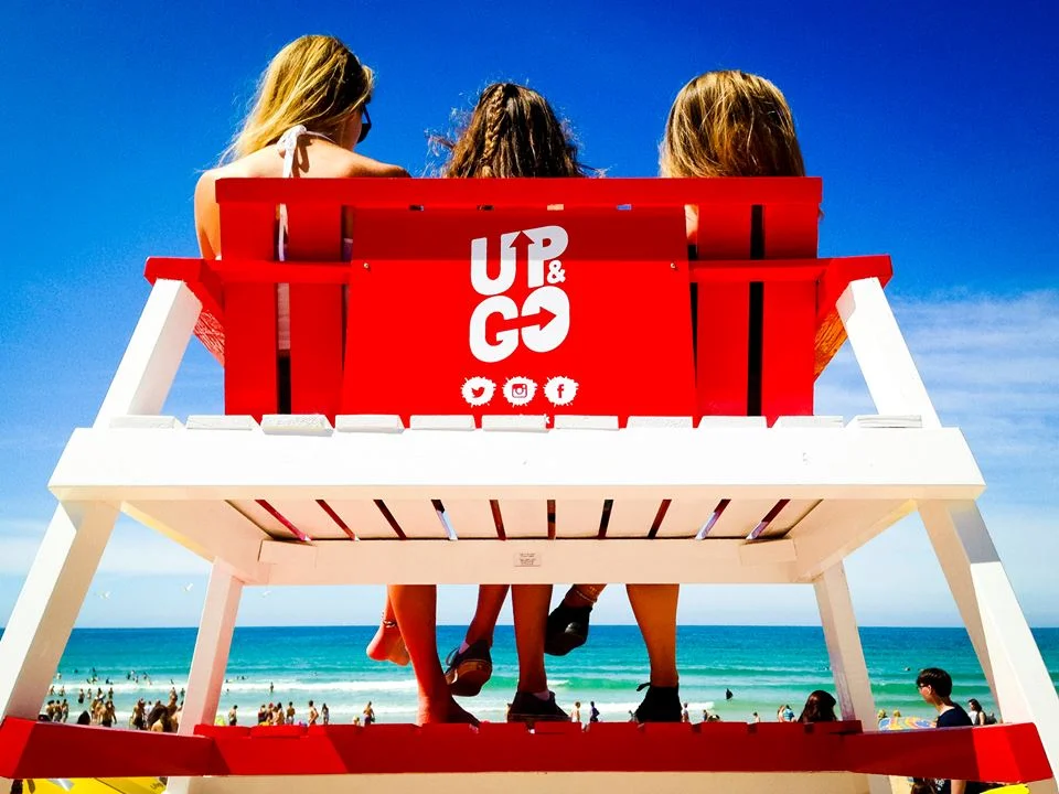
I remember Up&Go breakfast drinks launching in New Zealand when I was a kid and everyone going mad for them. Well they've now hit the UK shores with a cheeky campaign to get them noticed. To engage their target audience, they worked with Lab5 to create an Aussie Surf Club style experience at this year's Boardmasters Festival in Cornwall.
Read MoreWhat To Do If The Bank Says No is the second e-book I've produced for MarketInvoice (you can see the other bits and bobs here). Useful for anyone with a small to medium business, I know I learned a hell of a lot. I've been working in-house with the lovely folk at MI and getting to work on all sorts of fun things so I'll have a bit more work coming to the site soon!
Read MoreI've done it. Finally done it. I've been talking about it for a while, but only really felt earlier this year that it was possible. It was all those lovely ex-colleagues-now-friends who did it. The ones who got in contact and wanted my help on their projects, the ones who referred me to their friends and their teams. They gave me the confidence to realise that I actually do have enough of a network to work for myself.
Read MoreKPMG wanted to start an annual cocktail competition for their internal staff, so they turned to LAB 5 to make the magic happen. Run by the irrepressible Frances, who has experience with some of the biggest global alcohol brands (and thus makes an exceptional cocktail herself), she came to me to to create an identity for the event.
Read MoreI've been working with the lovely people at Corporate Research Forum for a couple of years now and, among other things, I've helped them to produce an online magazine called Progress. We're up to the Issue 3 now, going live this week. For the cover illustration, I took inspiration from a famous philosopher "Ogres are like onions, they have layers". Not to compare business leaders to ogres, but the analogy fits nicely when talking about the qualities that make a great leader.
Read MoreA few weeks ago I had a nice little project come my way, via an ex-colleague/international-man-of-mystery, Dougal. He's now at the International Publishers Association, and they needed a a logo for their 2016 Congress, to be held in London.
Read Morewhat came first, the chicken or the egg? the design or the brief? Sometimes, when working on a project, you take a wander down a train of thought in Illustrator and come up with something unexpected that you like, but isn't right for the client or doesn't fit the brief. You wrestle with it for a while... is there something you can do to make it fit? Can it be adapted/tweaked/coerced? Or do you just accept that it's the doily of design - pretty, but pointless?
Read MoreAs a someone who loves a to-do list and the neat swoosh that your pen makes when something is crossed off, I couldn't help but admire the administerial simplicity of Nicky Cooper marrying John Cooper. They get to plan the wedding, have the ceremony, then whoosh, off on honey moon with a satisfying lack of paper work.
Read MoreJo and Tim are getting married in New Zealand in April. While both proper kiwi kids (albeit living in London these last 7 years) they both have British heritage. Family is really important to them, so they came to me asking if they could include an English rose and a Scottish thistle intertwining to show their history combining into one future.
Read MoreHere's a quick peek at Whitney and Marc's save the dates for their wedding next year. Marc is from Luxembourg, Whitney is from the US. They are getting married on Independence Day, so wanted a red, white and blue theme, but also wanted to reference the two countries uniting. I stumbled across a gorgeous old stamp from the 1960's and adapted the lion to be marching along with a simplified american flag.
Read MoreWell hello there, first blog post of the new site. Now if only I had anything interesting to say. This is going to be more of a personal project I think, I don't expect anyone to actually read my ravings, but it's nice to have a place to catalog design-related thoughts and not bore distant relatives on Facebook.
Read More