Branding
A selection of logos and branded elements created for various clients.
Branding
A selection of logos and branded elements created for various clients.
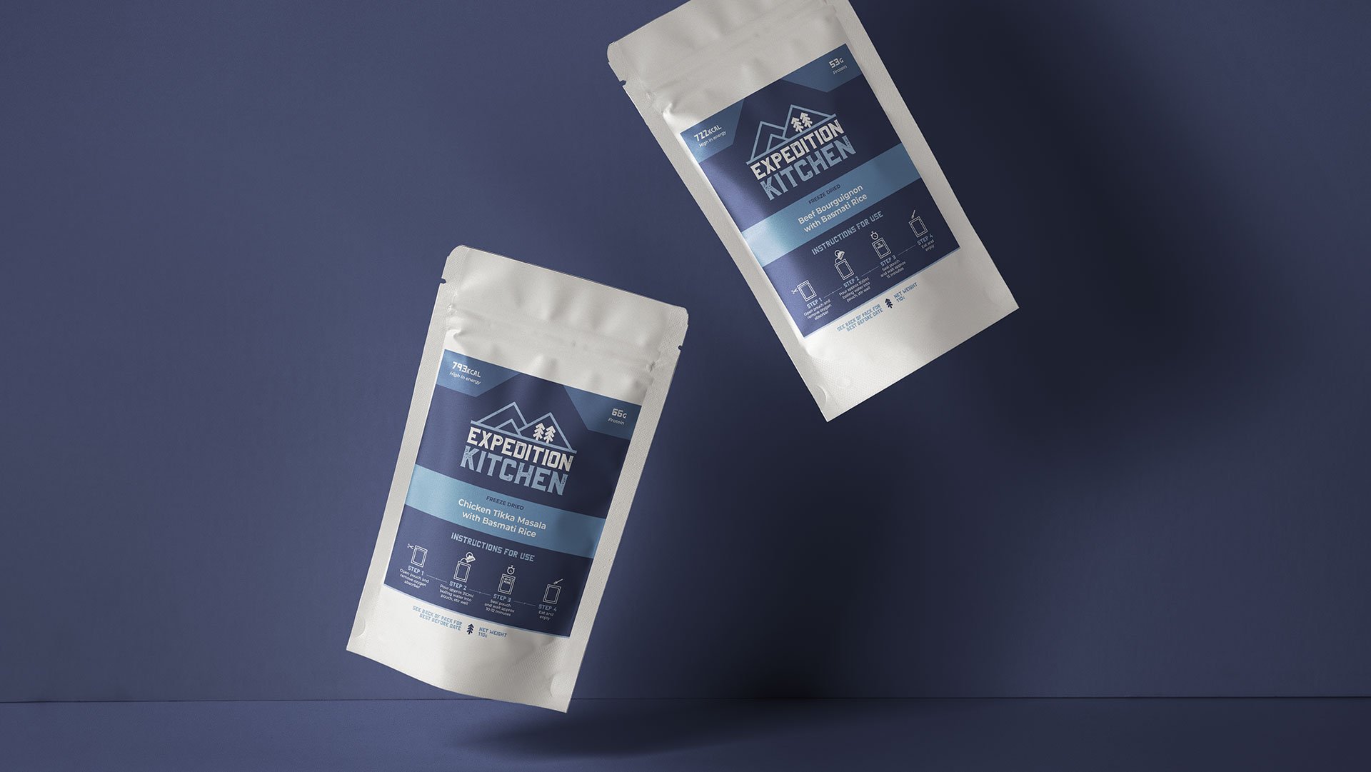
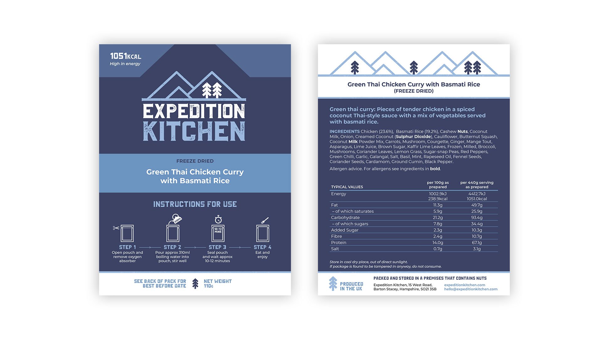
Expedition Kitchen
Logo and packaging // 2019
The adventurer-seekers behind the Yukon 1000 are no strangers to campfire meals but they weren’t satisfied with the existing outdoor food range on the market. They saw an opportunity to create a better product that was easily transportable, quick to make, and nutritious enough to refuel even the most exhausted explorers. The result: Expedition Kitchen, a range of freeze-dried adventure, survival and emergency ration meals produced in the UK. I created the logo and designed the packaging.
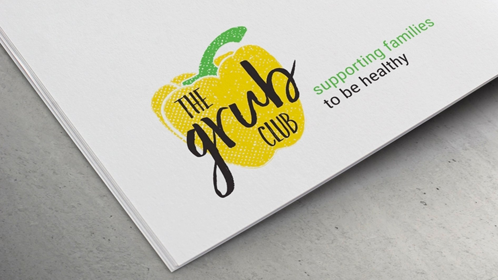
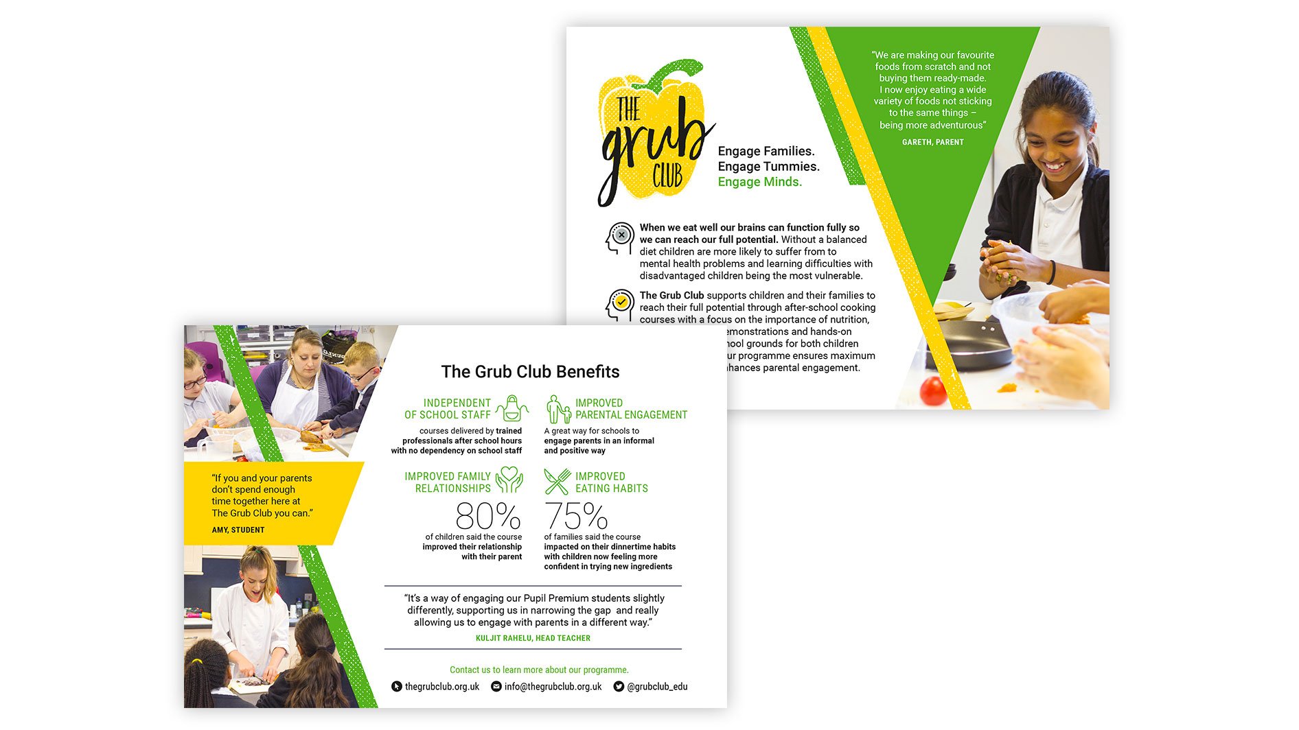
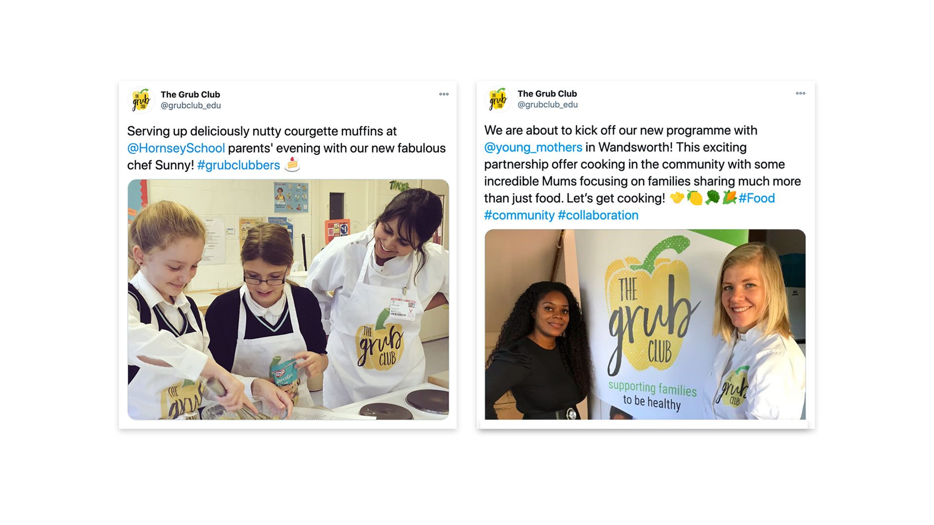
The Grub Club
Logo, brand guidelines, flyers, pull-up banners, photography // 2016
The Grub Club provides free cooking classes to low-income families. School children and their parents attend the class to learn how to cook nutritious and affordable meals in a fun environment. The club is based on the knowledge that when we eat well our brains can function fully and we can reach our full potential. For the logo, I drew a chubby yellow pepper and overlaid a distressed texture to convey the messy hands-on fun of the club. Hand-drawn style typeface is Faith and Glory.
I also whipped up some brand guidelines as well as a few other branded items like flyers, pull-up banners, and some statistics for the website. I was also lucky enough to visit a club in action to take some photographs for the marketing materials.
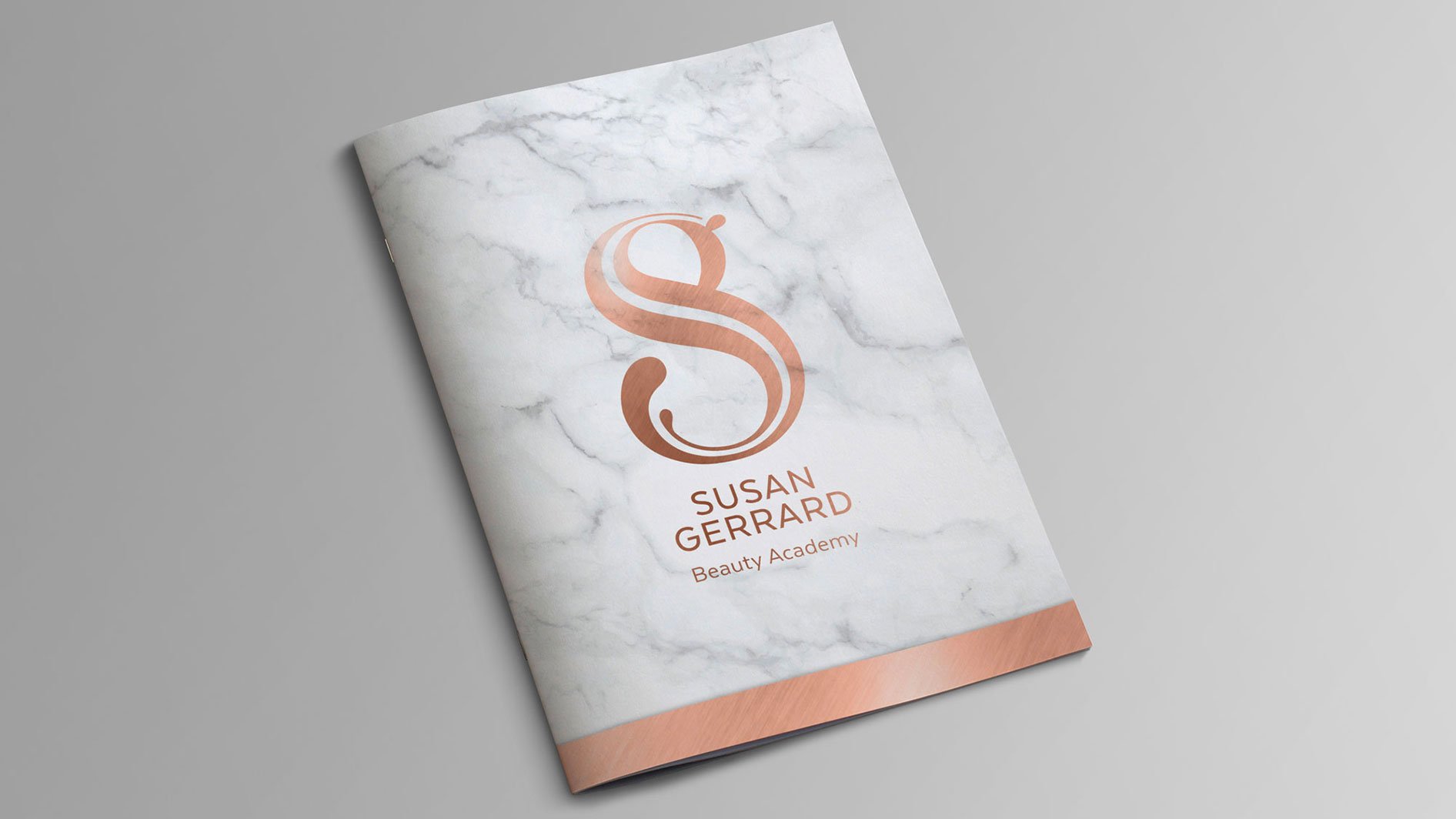
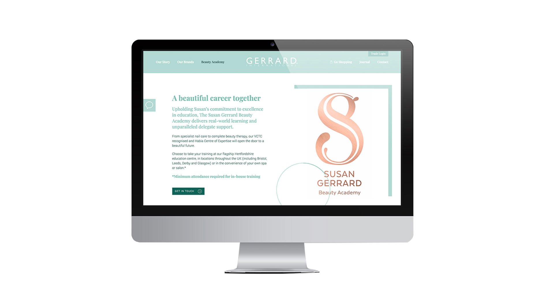
Susan Gerrard Beauty Academy
Logo and course materials // 2018
Founded in 1992, Gerrard International is a family-owned and run beauty business that has a portfolio of leading professional beauty brands. Susan Gerrard is an icon in the UK beauty industry, and in 2018 they launched the Susan Gerrard Beauty Academy. Working with the marketing cosmetics genius that is Mary Tabitha from Mii Cosmetics Australia, we created a visual identity and course materials to get the Academy up and running. The logo is constructed from a nested S and G, finished in luxe textures.
See more of the work from this project, including the course materials:
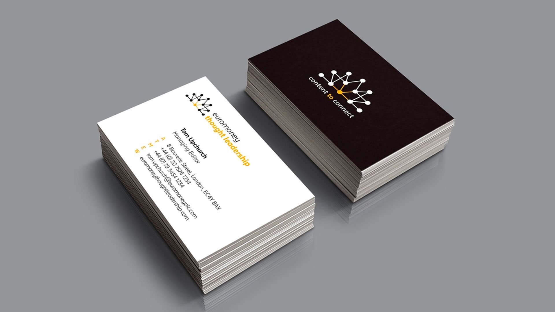
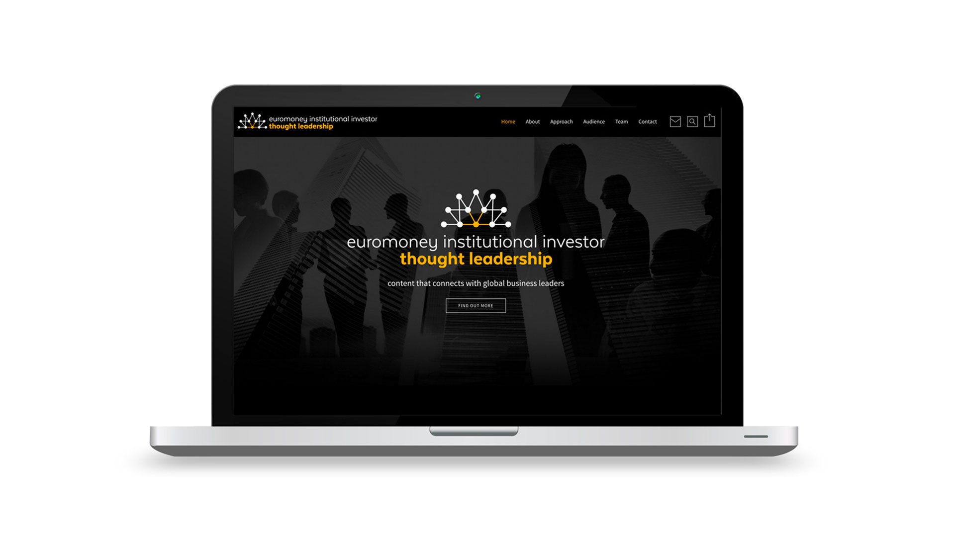
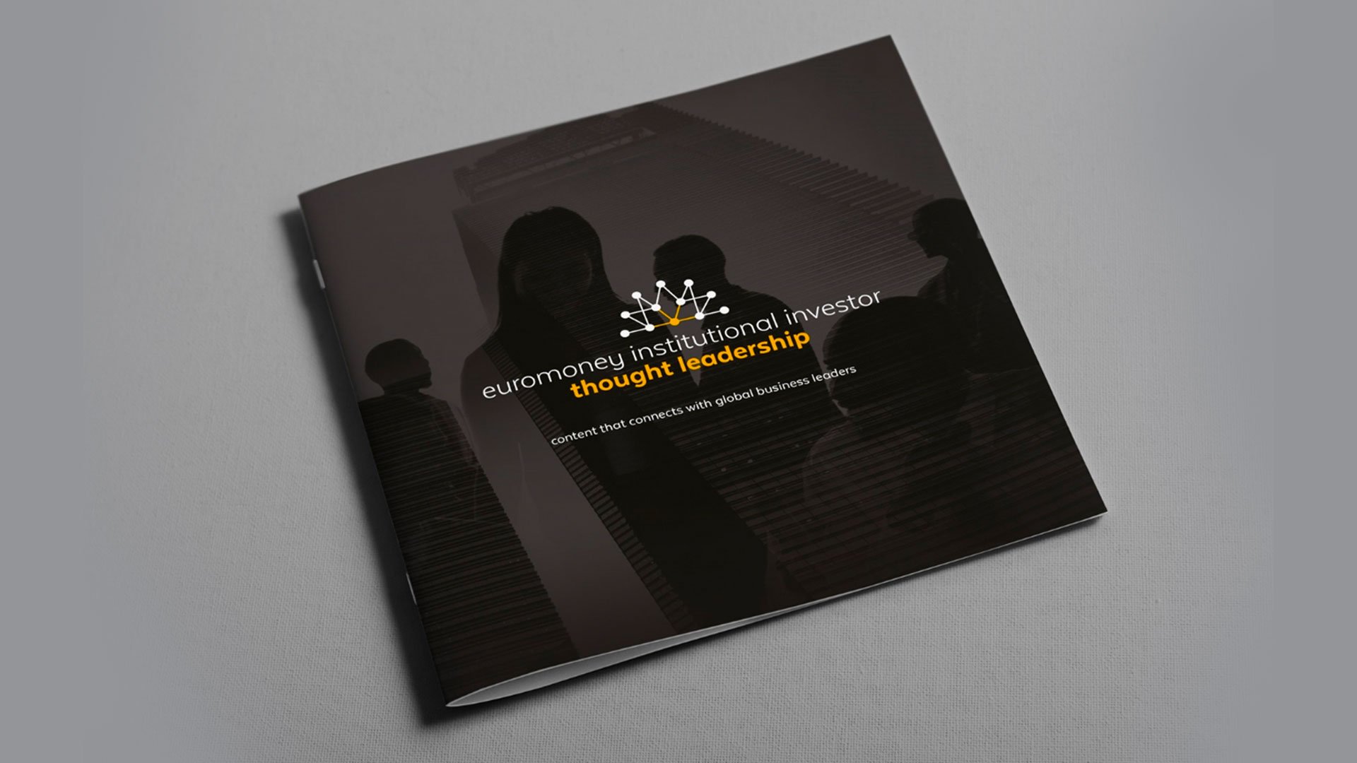
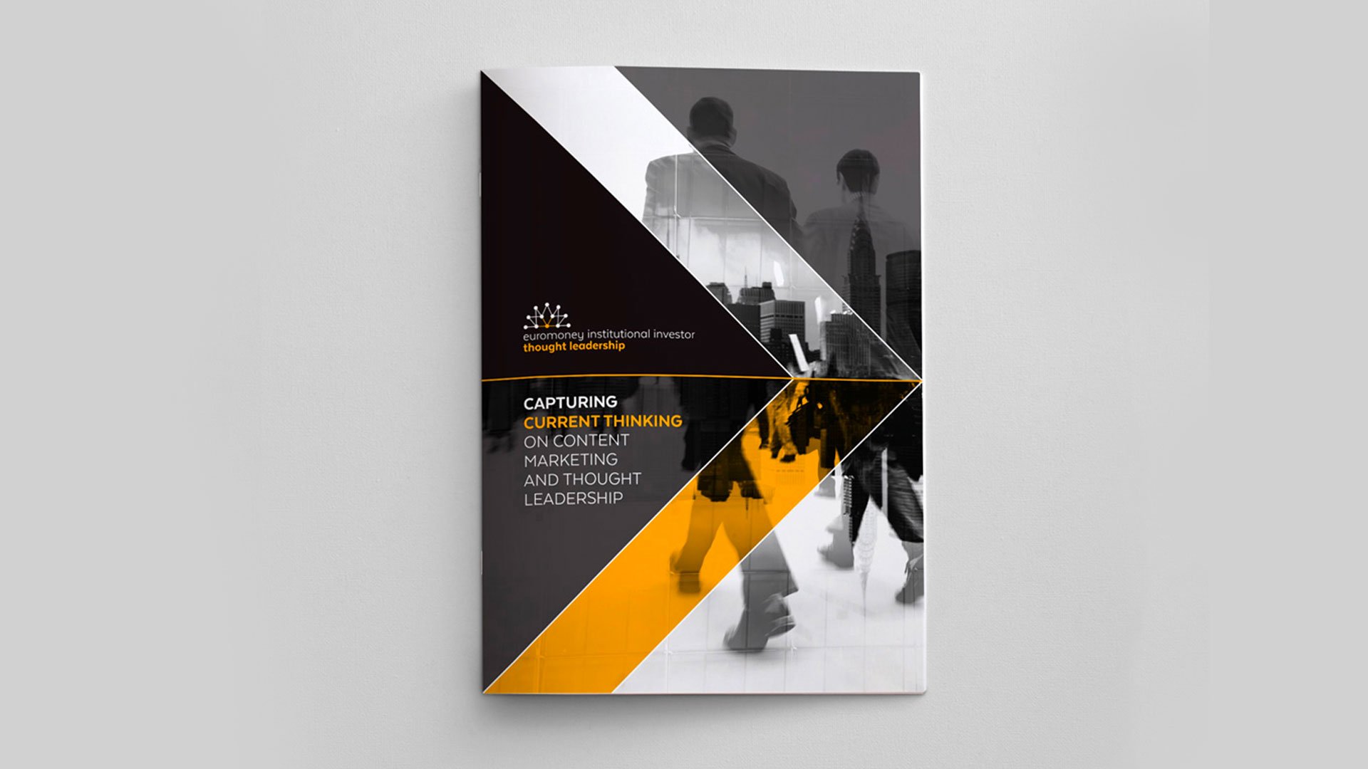
Euromoney Institutional Investor Thought Leadership
Logo, website, marketing materials // 2015
Euromoney Institutional Investor Thought Leadership creates thought-provoking content for global business audiences. One of EIITL's key USPs is its access to the Euromoney Thought Leaders Network - a survey panel of over 5 million highly engaged senior business leaders from across a range of strategic sectors. This idea of connecting the dots is reflected in the logo. It references the bringing of ideas, people and data together to generate new insights. Note: in 2023 this business was acquired by Delinian.
.
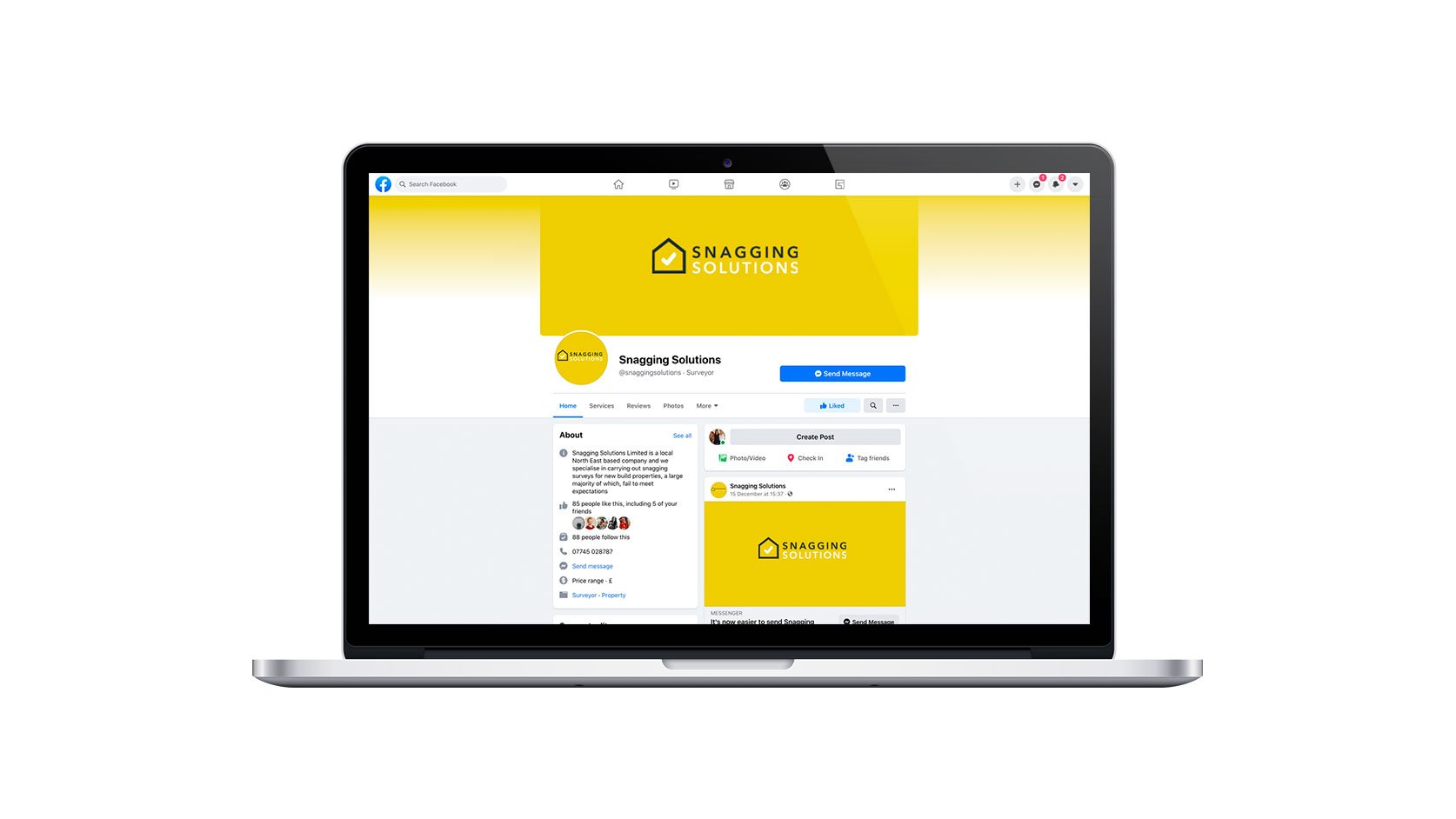
Snagging Solutions
Logo // 2019
Imagine moving into your brand new home and finding unfinished or shoddy workmanship. That’s where Snagging Solutions comes in. This North East business specialises in carrying out surveys for new build properties, a large majority of which sadly fail to meet expectations.
The brief was for a simple and clear logo – the house-building process is complicated enough, so Snagging Solutions wanted to convey a sense of being straight to the point and a business that could be trusted. The final identity uses a bright yellow and a tick in a house to convey being outcome driven.
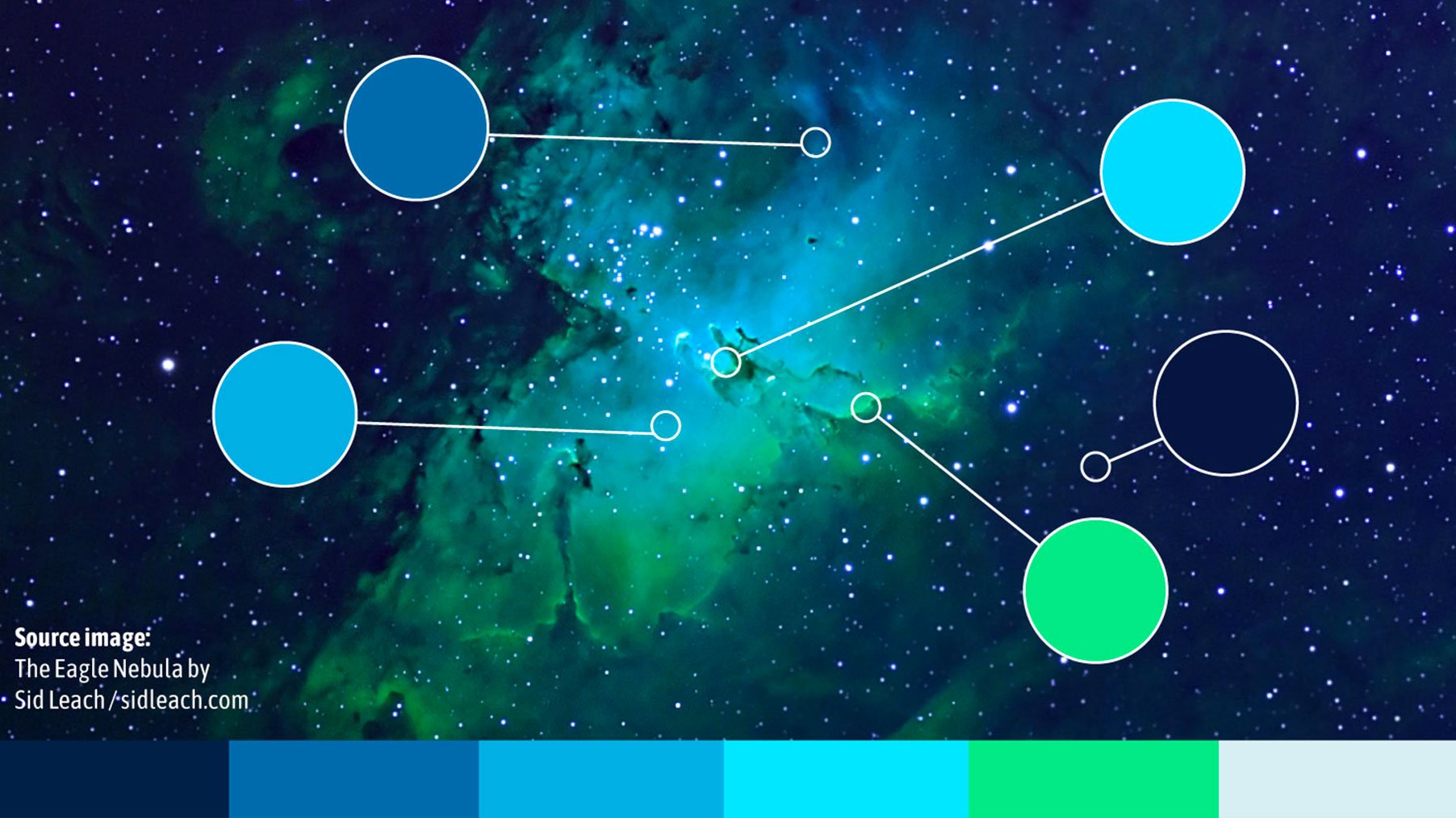
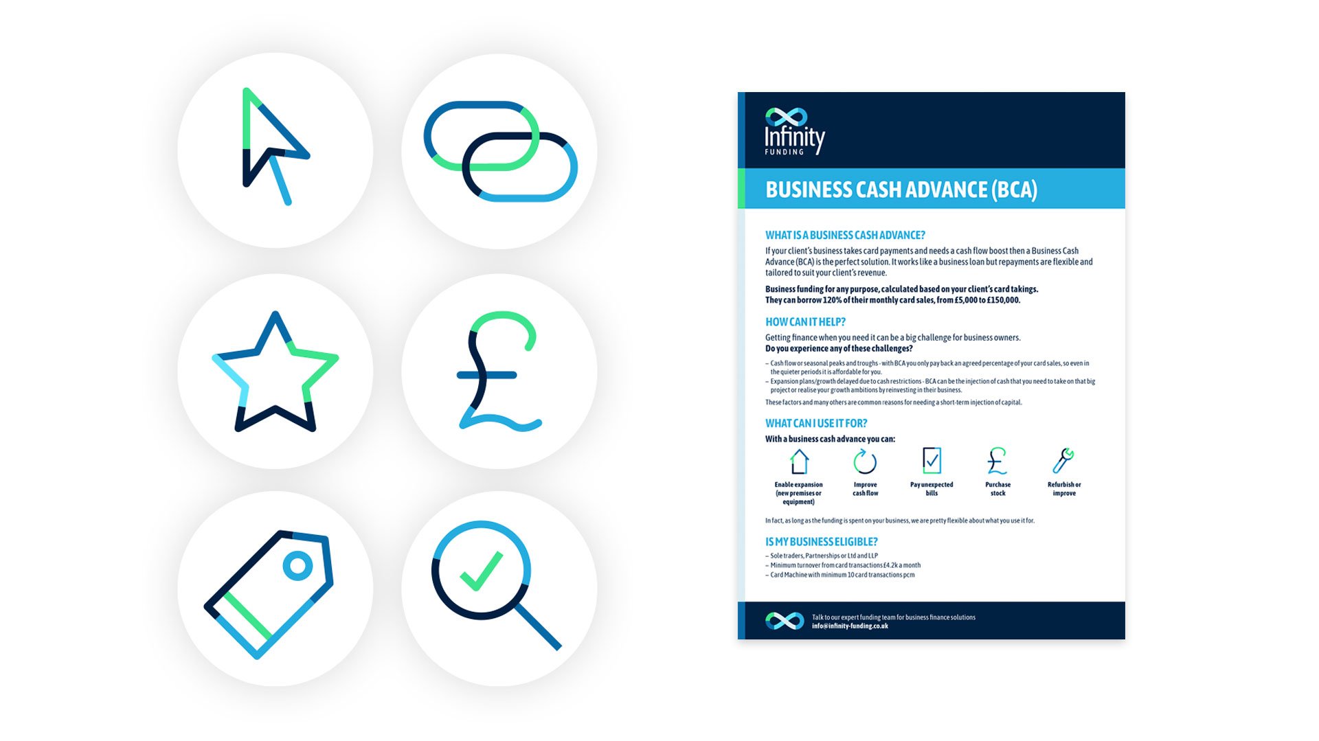
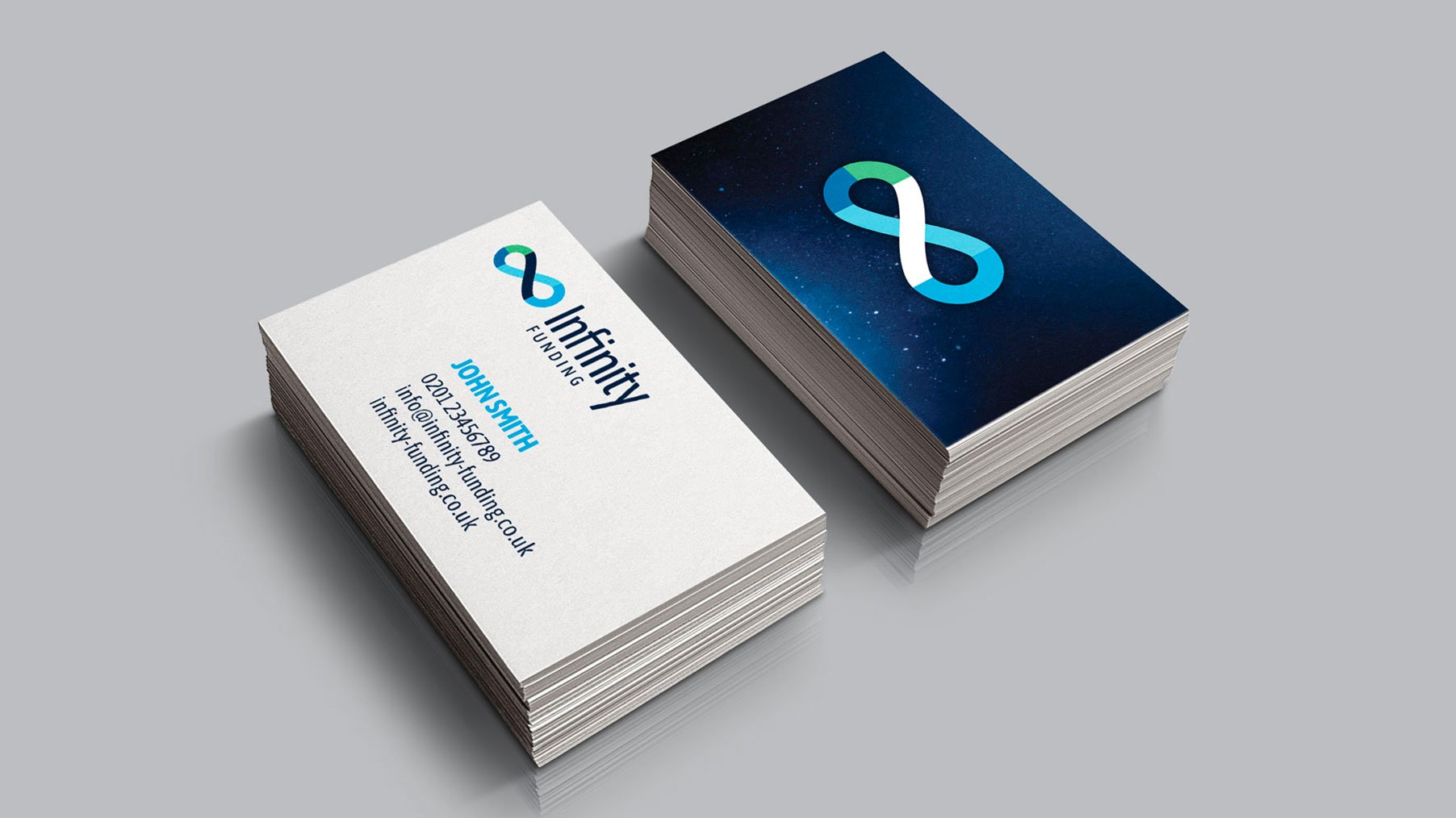
Infinity Funding
Logo, flyers, business cards // 2017
Infinity Funding is a consultative service that works in the business finance sector. They match businesses who need finance with the right lender. The client wanted a futuristic feel so I looked to astrophotography to provide colour inspiration. I fell instantly in love with an image of the Eagle Nebula that had an otherworldly palette of blues and fluorescent greens. The logo features an infinity symbol constructed of modular sections which translates to a bespoke iconography style used on other materials.
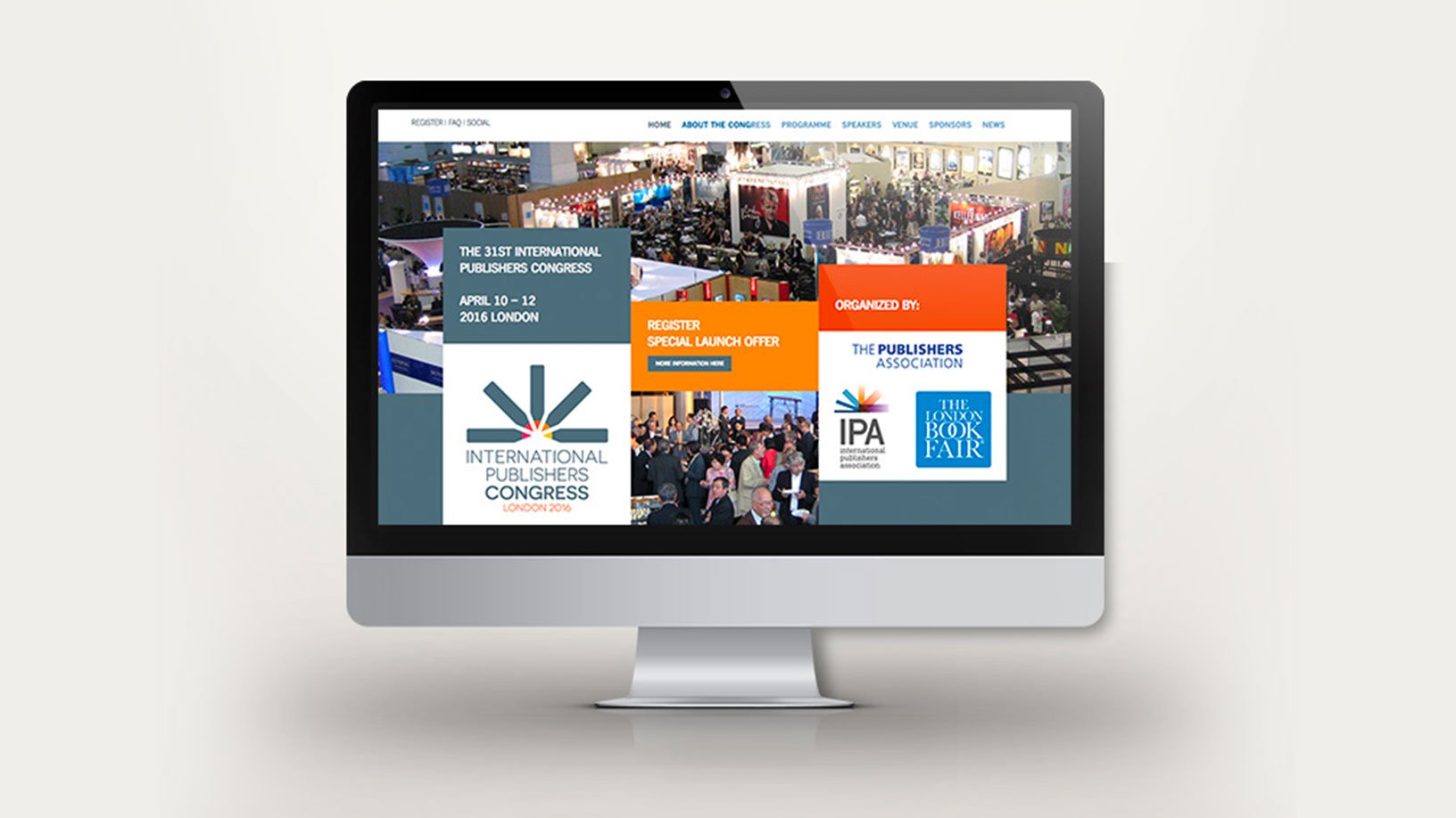
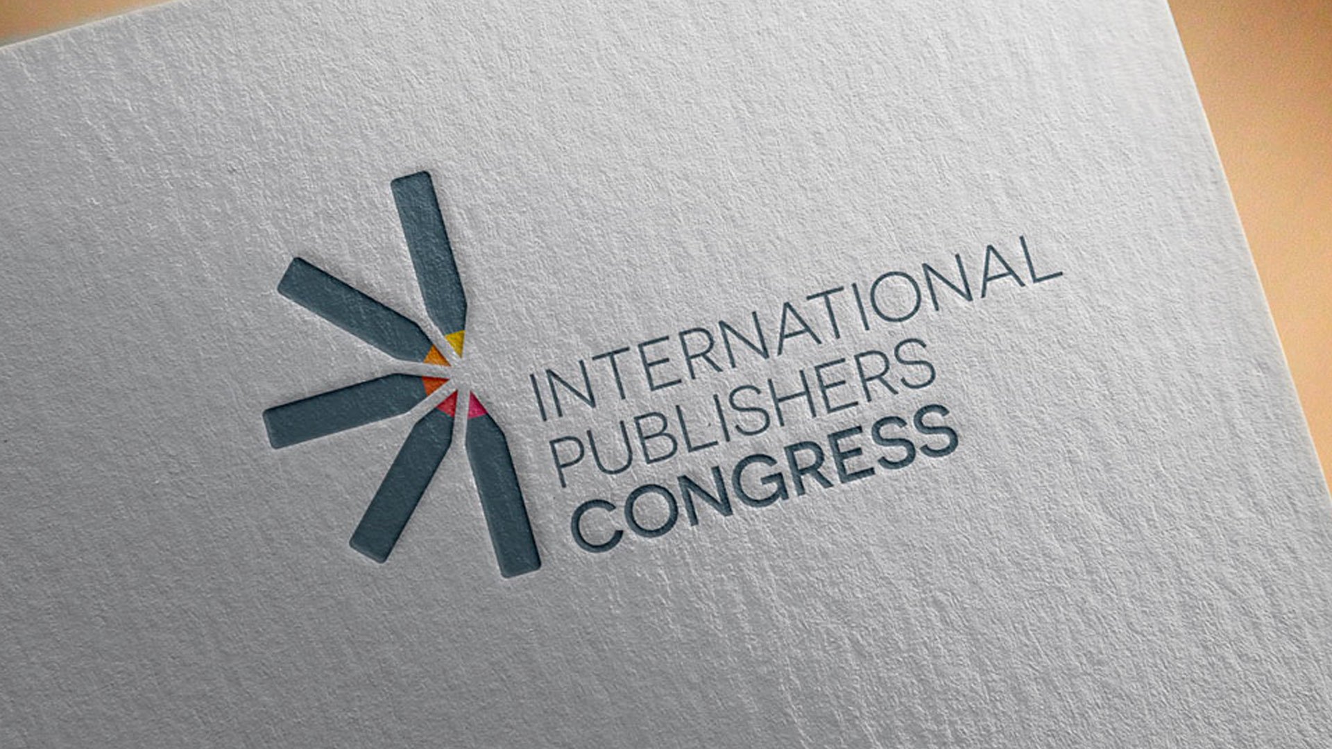
International Publishers Congress
Logo // 2015
The International Publishers Congress was an annual event that brings together over 600 leaders from the international publishing world. For the logo, I included references to an open book and the act of writing, but by turning the book into an abstract sunrise, it also references the new digital dawn of publishing. The bright warm palette translates well onto other materials, from the website, to banners and brochures.